Summary
“Wow!” moments don’t happen randomly. At Kentik, they reflect product value, differentiators, and the hard work of our engineering team. In this post, we look at a few of those moments when the insight delivered by Kentik made customers say, “Wow, that was amazing!”
Metrics and statistics tell us a lot about how our customers engage with Kentik — things like how often they log in, which features they’re using, and how many support cases they’ve opened. But sometimes we can immediately tell we’re delivering a great product experience from feedback that’s more qualitative. We call the best examples of this feedback “Wow!” moments — the moments where Kentik delivers an insight that makes customers say, “Wow, that was amazing!”
“Wow!” moments don’t happen randomly. They reflect product value, differentiators, and the hard work of our engineering team. These are the “magic metrics” that make Kentik stand out from the crowd by being significantly better than other products.
In this blog post, we picked six “Wow!” moments shared with us by Kentik customers. These are based on experiences from when customers first used Kentik, or later when Kentik helped resolve a tricky network problem. All of them highlight how network data insights revealed by Kentik made their jaws drop.
1. Sankey Diagram for BGP Analytics
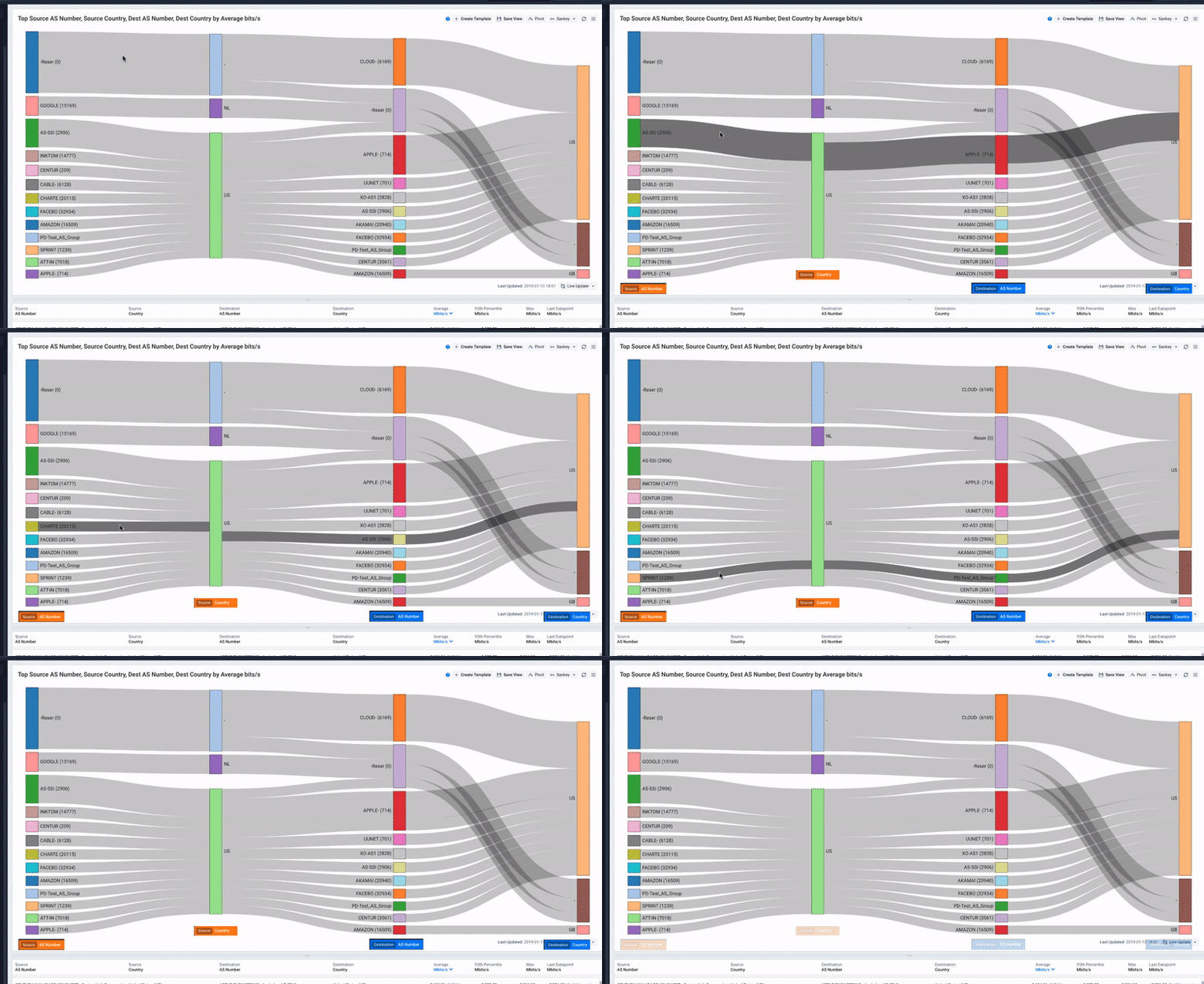
Kentik’s BGP analytics illustrate traffic per BGP path, with each hop represented as a separate column. The sizes of the bars and lines are in proportion to the volume of traffic through each path and hop. This allows customers to quickly grasp both the big picture and details of Internet routing.
We caught many priceless looks as users first saw our Data Explorer displaying visualizations of paths, neighbors, transits, origins, countries and the traffic distribution among them.
2. Time Range Navigation and Aggregation
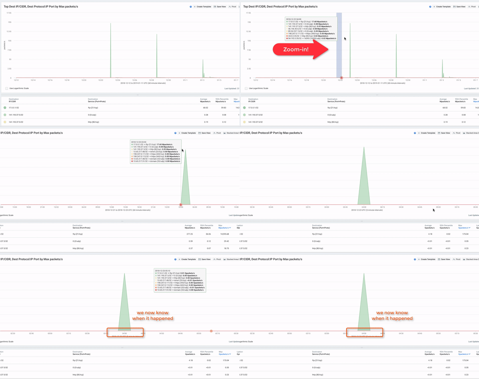
Kentik automatically aggregates time series data in graphs and charts into steps that make sense for the currently selected time range. For example, in a 30-day graph, each data point represents 1 hour; in a 1-day graph each point is 10 minutes, and in a 1-hour graph, each point is 1 minute. The data visualization is dynamic and interactive, so you can quickly zoom in by selecting an area of interest. This makes it very easy to drill down on narrower time ranges where you see abnormal behavior, such as traffic spikes, to get more detail.
3. Data Pivot and Navigation
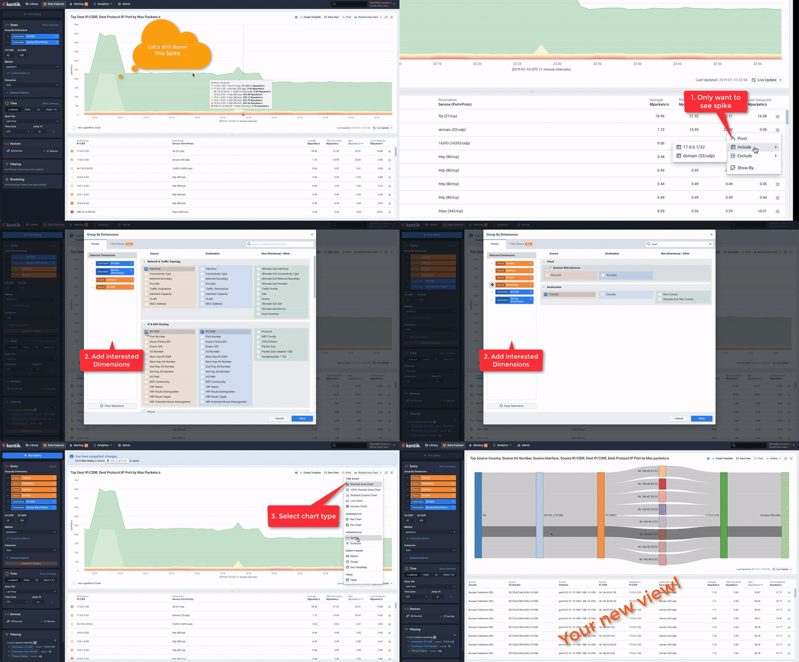
Kentik retains all the data it receives, so there’s no limit to the granularity or detail that can be displayed. Aside from the ability to drill down into narrower time ranges, the Data Explorer makes it easy to pivot the data by adding or changing dimensions and filters to pinpoint exactly the view needed to understand an incident. It’s also easy to switch between visualization types to highlight meaningful data.
4. API First
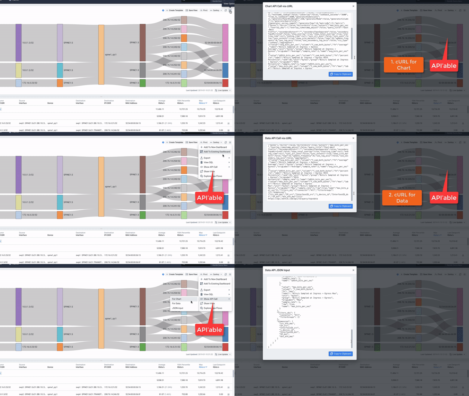
Nearly everything in Kentik can be accessed by a simple REST API, which a lot of our customers find super helpful. Using APIs to integrate Kentik with other systems is a very powerful mechanism to leverage both the capabilities of the Kentik platform and the traffic data stored with Kentik. The “Show API Call” feature in the Data Explorer makes it simple to get a pre-built API call example for any query, allowing users to fetch either the raw data or a pre-built image file.
5. Alert Investigation Dashboards
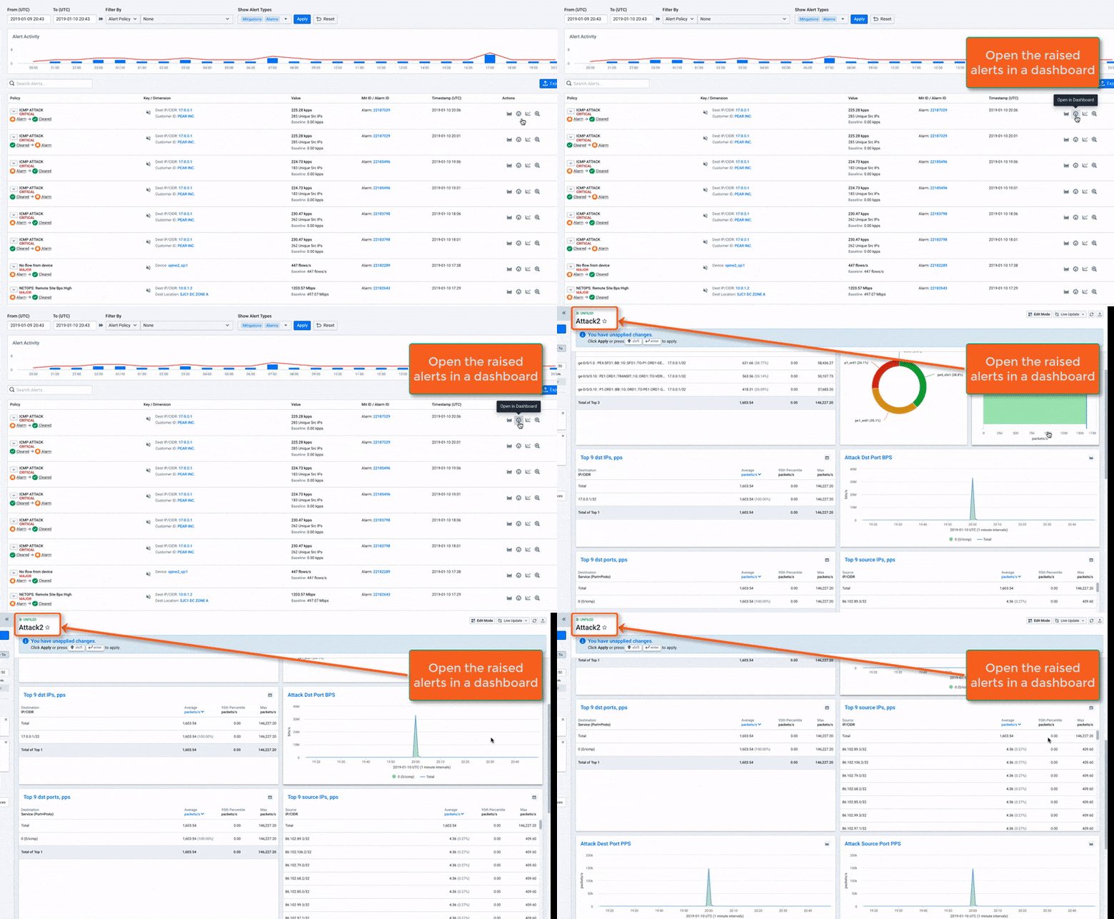
When a user gets a notification from a Kentik alert policy on Slack, e-mail, or some other channel, they can view the new alerts in the “Alerting” section of the Kentik UI. Each alert policy is associated with a specific dashboard — either built-in or custom. Clicking on the dashboard icon next to an alarm opens up the associated dashboard with filters pre-set for all of the attributes associated with the alert. This saves steps and time and allows users to instantly see all the breakdowns that are useful for investigating each type of alarm.
6. Guided Mode Dashboards
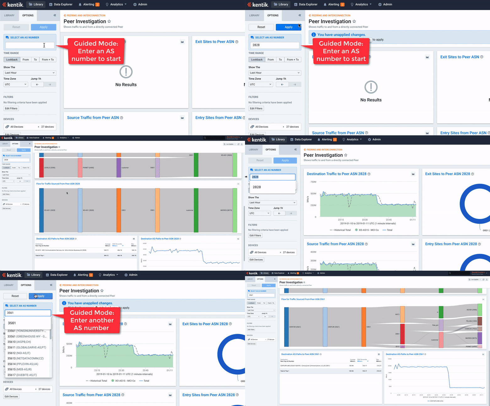
Customers who have seen guided mode dashboards really like the flexibility it provides to create customized workflows within Kentik. The guided mode allows users to enter a single value or variable and instantly pivot multiple perspectives on the same dashboard, without repeatedly setting up query options. Guided mode dashboards extend the value of network data by making it accessible for semi-technical or non-technical users.
Summary
Yesterday’s “Wow!” quickly becomes today’s ordinary. That’s why Kentik is continually innovating new features and functionality, and working to create more new “Wow!” moments for our customers. Please check back for additional posts in this series.
Special thanks to Kentik’s talented solution architects and our customers who share these stories.
