Introducing BGP Peering Analytics in Kentik Detect

Summary
By mapping customer traffic merged with topology and BGP data, Kentik Detect now provides a way to visualize traffic flow across across your network, through the Internet, and to a destination. This new Peering Analytics feature will primarily be used to determine who to peer (interconnect) with. But as you’ll see, Peering Analytics has use cases far beyond peering.
New Kentik Detect Section Shows More than Pretty Pictures

Back when we launched Kentik last June, I talked about the reasons that I was excited to get involved with the company (see 20 Years of Flying Blind). Our initial task was to enable fast spelunking of network traffic data, both present-time and historical, to help operators see and understand what’s happening on their infrastructure. Once that was well underway it was time to provide a way to visualize traffic flow across your network, through the Internet, and to a destination. By mapping the customer’s traffic merged with topology and BGP data, we’ve now done that in Kentik Detect.
Peering is typically the act of determining who one’s network should connect to and creating those relationships. So we’ve called this new feature Peering Analytics, because it will primarily be used to determine who to peer (interconnect) with. But as you’ll see, Peering Analytics — which launched in November 2015 and has now emerged from Beta into a full v1 release — has use cases far beyond peering.
BGP plus flow
BGP analysis tells you a tremendous amount about how traffic gets where it’s going.
Analyzing BGP paths is a very powerful way to tell a tremendous amount about how your traffic gets where it’s going. But until now most BGP path tools have typically been limited to looking strictly at BGP paths. That allows you to see how you could get traffic to a given AS, but not whether you actually have traffic on any given path (or, if you do, how much traffic). What we did instead is develop a solution that takes advantage of all of the raw flow records (NetFlow, IPFIX, sFlow, pcap, etc.) that we collect in Kentik Data Engine (our clustered HA datastore) and merges them with the customer’s BGP data in realtime. So now you can see not only what paths are available to you, but what paths you’re actually using, and what your volume of traffic is on each.
Our goal for this new peering feature was that users would be able to accomplish all of the following in a single top-level view:
- quickly notice path, peering, or traffic engineering anomalies;
- pick a specific peer, customer, or site and see a complete picture of where the traffic is coming from, passing through, and exiting;
- see at a glance which countries traffic is destined to;
- pick an individual traffic-infused BGP path out of a visualization and see all of the details including how it changed over time;
- potentially determine the cost involved in getting traffic where it’s going.
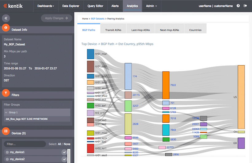
Using the initial iteration of our peering analysis feature you’ll be able to easily answer many of your most important questions about the traffic on your network:
- Who is my traffic going too? How is it getting there? Which country or region does it ultimately terminate in?
- With whom should I directly interconnect? Which transit provider should I buy my next circuit from?
- For a particular server, customer or peer, how much traffic is there? Where is that traffic going to? How much is it costing me?
- Are my peers taking the traffic (and only the traffic) they should be?
- Is it time to add circuits to my network? If so, where should they go from/to (internal or external)?
- What opportunities are out there for our company, as an ISP, to sell to? Is there anyone that I’m not connected to but I send traffic to?
Using Peering Analytics
Now that we’ve established the value of peering analytics in Kentik Detect, how do you actually use it? It basically boils down to just three steps, which we’ll go into in greater detail below:
- Generate a BGP dataset.
- Launch peering analysis on the BGP dataset.
- Use the filtering tools (dimensions, devices, interfaces, ASNs) to drill down into lower-level detail.
Generating a dataset involves narrowing the entire set of the flow and BGP data collected for your organization in KDE down to a subset that focuses on the time-range and devices that you’re interested in, which you can further filter based on exporting devices, minimum traffic volume per AS_PATH, source and destination AS, interfaces, and any of the 50+ filtering criteria found in the Data Explorer. We store this data in a “peering” aggregation format that allows quick exploration of paths.
Once a dataset build is complete you can launch peering analytics for that dataset. In the peering portal you’ll see tabs for five top-level visualizations of your traffic: BGP Paths, Transit ASNs, Last-Hop ASNs, Next_Hop ASNs, and Countries. Each of these tabs contain an interactive Sankey diagram — like the one shown above for BGP Path — that you can click on to drill down on paths related to an individual AS. The tabs also contain line charts and tables. For the BGP Paths tab, these appear like the following:
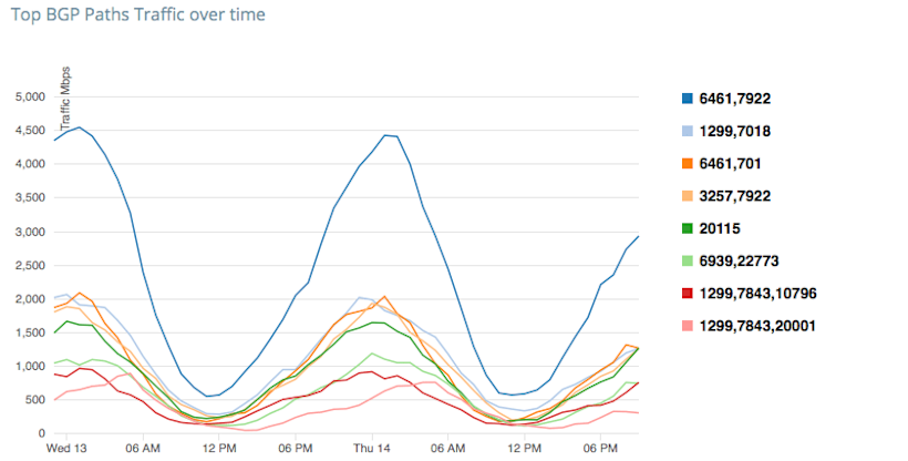
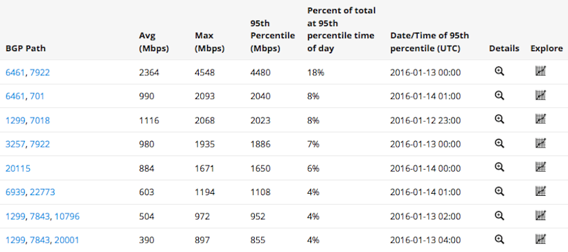
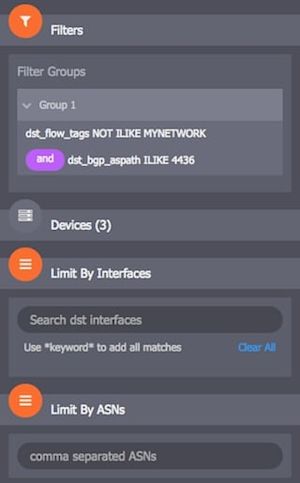
While the tabs give a great deal of detail, you can narrow your view further by drilling down within the visualizations, by selecting or deselecting exporting devices, and by filtering lists of ASNs.
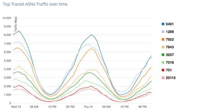
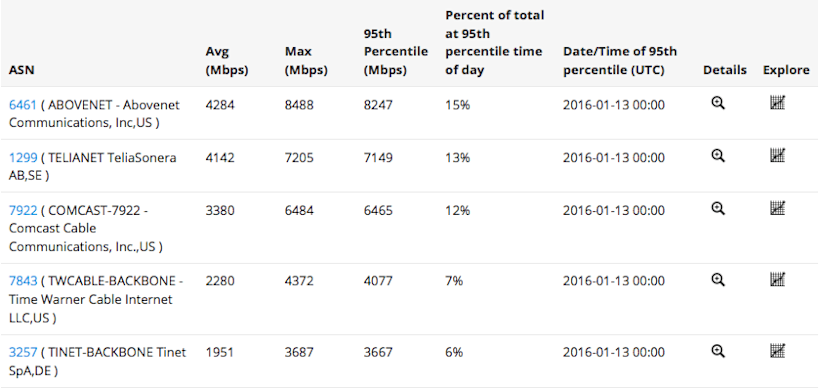
One simple example of a typical peering analytics use case would be to exclude first-hop ASN from the visualizations so you can look at transit ASN traffic, allowing you to see candidate transit providers based on destination country. The last image below shows a line chart and table of traffic by Transit ASNs with the first hop ignored.
It’s not necessarily hard to take a large set of data like NetFlow records and BGP routing updates, filter it down, and then compile a set of nice graphs. The problem is that once you compile, the dataset and all of the graphs are static. If you need a different perspective, you have to start over and compile a whole new dataset. That takes too much time to be practical as a way for network operators to get useful answers whenever they want. We had something more flexible in mind. Like our Data Explorer, we designed Peering Analytics to allow you to change views, apply filters, drill down, and keep adjusting until you see the data that answers your question.
The Analytics roadmap
Peering analytics is part of a bigger context in which we’ll offer a wide variety of analytics using datasets.
As we develop our Peering Analytics feature in subsequent versions we’ll be looking at enhancements such as integration with PeeringDB, next-hop integration for East-West analysis, site-level aggregation, scheduled e-mail reporting with “difference information” and ingress flow analysis with confidence information. Also, we’ve built peering analytics as part of a bigger context, which is that we want to be able to offer users a wide variety of analytics features that utilize datasets. That’s why we’ve built peering analytics as one component of a new Analytics section in our portal. The emphasis in this section is on revealing the big picture over the long term (e.g. let’s look at the last 30 days, p95th for an entire network) while also enabling a deep dive into lower-level details. Among the most promising possibilities to include this section are Congestion Analysis, East-West Traffic Analysis, Threat Analysis, and CDN Analysis.
We’ll cover key use cases of Peering Analytics in forthcoming blog posts. If you’re a content provider, ISP, wholesale service provider, or large enterprise with significant transit or peering connectivity, I think you’ll find a lot that can help you run your network better. So I hope you’ll give our team a chance to give you a demo and get you started on a free trial.

