Using Interface Classification in Kentik Detect

Summary
In our latest post on Interface Classification, we look beyond what it is and how it works to why it’s useful, illustrated with a few use cases that demonstrate its practical value. By segmenting traffic based on interface characteristics (Connectivity Type and Network Boundary), you’ll be able to easily see and export valuable intelligence related to the cost and ROI of carrying a given customer’s traffic.
Analyzing Your Connections for Competitive Advantage
In our first post on Interface Classification, we looked at what it is and how it works. This time we’ll follow up with more specifics on why it’s useful, illustrating with a few use cases that demonstrate the practical value of this new feature. To briefly review, Interface Classification enables an organization to quickly and efficiently assign a Connectivity Type and Network Boundary value to every interface in the network, and to store those values in the Kentik Data Engine (KDE) records of each flow that is ingested by Kentik Detect. Associating the classification information of interfaces with the flows that pass through those interfaces makes it possible for queries to segment traffic based on interface characteristics. For a closer look at how this is achieved, check out the Interface Classification article in our Knowledge Base.
The easiest place to see Interface Classification in action is the Data Explorer in the Kentik Detect portal. Interface classifications may be accessed here in two forms:
- Group-by dimensions (sidebar Query pane): Set the combination of fields that define a set of traffic that can be counted (by metric) and ranked.
- Filters (sidebar Filters pane): Include or exclude traffic records that contain a specified value in the field that you’re filtering on.
The following table shows the columns in which the Interface Classification values are stored in the records of the KDE and how they are referred to in the Data Explorer UI.
| Portal dimensions and filters | KDE field name |
|---|---|
| Portal dimensions and filters | KDE field name |
| SOURCE: Connectivity Type | `i_src_connect_type_name` |
| SOURCE: Network Boundary | `i_src_network_bndry_name` |
| DESTINATION: Connectivity Type | `i_dst_connect_type_name` |
| DESTINATION: Network Boundary | `i_dst_network_bndry_name` |
In the next sections we’ll look at how these new dimensions can be easily applied in some very common use cases. Without them, performing the same tasks would require devoting significantly more effort to the construction of queries.
Checking Country-level Connectivity
One common task for network operators is to regularly review global connectivity, often evaluating it on a country-by-country basis. To intelligently price content destined for a given country, for example, content providers need a pretty good idea how much it actually costs them to deliver traffic to that locale. With costs of bandwidth varying from PNI (Private Network Interconnect) to Transit, it’s typically useful to look at segmentation for traffic — either inbound or outbound, depending on whether you are a content provider, carrier, or ISP — to each country of interest.
We set up for this type of analysis using the following settings in the sidebar of the Data Explorer:
- Group-by dimensions: [Destination] Connectivity Type
- Filters (ANDed):
- Destination Network Boundary = external
- Destination Country = FR (France for this example) - Devices: Select all routers. We don’t need to be more specific because the Network Boundary filter will ensure that we only query on traffic as it exits the network.
- Display Type: Pie Chart (gives us a quick visual overview).
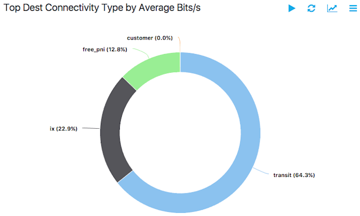
After we click Apply Changes, we can see in the result shown above that a lot of the French traffic goes through transit, which is the most costly form of connectivity. We can go deeper on this first pass of investigation by figuring out which PoPs said traffic is delivered by, and, even more precisely, which devices and towards which ISP networks.
To do this our Data Explorer settings would be as follows:
- Dimensions/Group By: [Full] Site, [Destination] Connectivity Type, [Full] Device, [Destination] Next-Hop ASN, [Destination] ASN.
- Display and Sort By (Advanced Options): 95th percentile (smooths out potential spikes).
- Filters (ANDed):
- Destination Network Boundary = external
- Destination Country = FR (France for this example) - Devices selected: Select all routers.
- Display Type: Sankey diagram
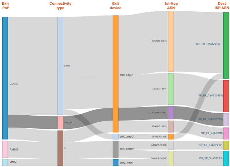
The resulting diagram shows where (from which of your devices) the traffic with a given destination ASN is leaving your network, as well as the 1st hop ASN for that traffic. By combining that information with your cost information for each of those ASes, you can now develop an overview of your outbound traffic cost structure in the selected country.
Optimizing Connectivity by Country
A lot of peering review meetings basically consist of reviewing connectivity in a given market and trying to see what can be optimized for cost and/or performance. Either way, it’s always a good practice to try to shift as much traffic as possible from transit to any form of peering (ideally free PNI, but possibly public peering in an IX fabric). Figuring out how to do that is effectively a two-step process.
Step one is to select the destination country. How you do this depends on whether you already know what destination country you want to study or whether you want to select that country based on how much transit connectivity it requires. For the latter analysis in Data Explorer we would use the following settings:
- Dimension/Group By: [Destination] Country
- Filters (ANDed):
- Destination Network Boundary = external
- Destination Connectivity Type = transit - Devices: Select all routers.
- Display Type: Time series stacked graph
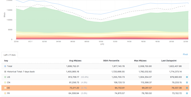
As shown above, we now have a list of destination countries that are ranked by transit connectivity. This tells us where the greatest potential lies for saving money by shifting from transit to peering. Let’s focus on Germany (DE) for our next step.
Step 2 is to look at the Destination ASNs for the given country. This is where Data Explorer’s drill-down capabilities become particularly useful. In the table under the graph, click on the Show Options icon at the right of the DE row. In the resulting popup menu, choose Show by » Destination » AS Number.

After applying the changes we have an ordered list of the top ASNs, in Germany, that are currently reached via transit, a.k.a a list of the traffic destinations with which it would be most beneficial for us to peer. This is valuable business intelligence that it would be far more difficult to obtain without our new Interface Classification dimensions.

Add Ultimate Exit for Deeper Intelligence
By now we have a good idea of the power that Interface Classification gives us in terms of extracting business value from network data. We can take this even further by marrying IC with another relatively new feature of Kentik Detect: Ultimate Exit. As a quick refresher (see this post to get fully reaquainted), Ultimate Exit augments flow records in KDE with information about the site, device, and interface of the exit point of the underlying flows from which the records are derived.
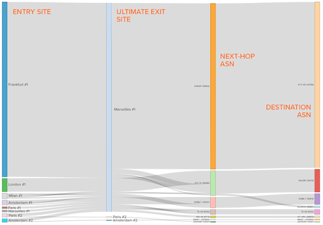
As shown in the Sankey diagram below, using this Ultimate Exit information allows you to slice traffic by the sites/devices/interfaces toward which it is headed so that you can see how much traffic is flowing between an entry site and an ultimate exit site/device/interface (the BGP ultimate exit dimension). You can also see which eyeball networks (the destination ASN) are reached by that traffic, and you can export that information for business analytics (from Options menu at top right of graph, choose Export » Table » as CSV). The business utility of this capability is to enable you to look at where transport is the most expensive between your entry site and ultimate exit site so that you can take appropriate steps to optimize.
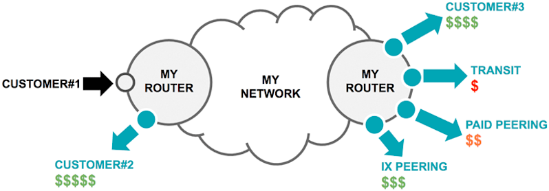
To understand the benefit of combining Interface Classification with Ultimate Exit, let’s assume that your cost per Mb/s depends on connectivity type, and that the greater the cost the lower your ROI. As shown in the following diagram, the resulting ROI hierarchy would be: transit (ROI = $) < paid peering (ROI = $$) < IX peering (ROI = $$$) < routing between devices across your network (ROI = $$$$) < routing within a single device, a.k.a. hot-potato-routing (ROI = $$$$$).
To maximize ROI, you need network business intelligence that tells you where the traffic you carry for a given customer falls into this hierarchy. You can get that information in Data Explorer using two new dimensions: BGP Ultimate Exit Connectivity Type and BGP Ultimate Exit Network Boundary. Here’s how to set up such a query:
- Dimension/Group By:
- [Source] AS Number: this isn’t crucial, but it helps us make sure that we’re catching ports for the right customer ASN.
- [Full] Site: the sites where we connect to our customer, named Customer AS1234)
- [Destination] BGP Ultimate Exit Site: the site where the customer’s traffic will be handed over, which will give us an idea of how much transport is involved for us to deliver it.
- [Destination] BGP Ultimate Exit Connectivity Type: the type of connectivity over which this customer’s traffic will be handed over. Can help calculate the cost of transport between Customer’s traffic entry and exit sites.
- [Destination] AS Number (optional).
- Filters: [Source] Interface Description.
- Devices: All edge routers.
- Display Type: SanKey Diagram.
This query yields us a Sankey with some very valuable ROI information. Focusing on the central part of the diagram, the annotations in the image below use color to show three different types of paths taken by the traffic of the customer in this example, with each representing different levels of ROI:
- Traffic on the pink path is the most profitable. This traffic is routed within the same site (Washington to Washington), so it has neither a metro nor long-haul cost. And since it’s delivered to another customer (Ultimate Exit Connectivity Type is “Customer”), it can be billed to that other customer.
- Traffic on the orange path is second in terms of ROI. It’s hot-potato-routed, so it has no transport costs, and it’s handed over via free PNI (Ultimate Exit Connectivity Type is “Free PNI”), so there’s no cost to deliver it. But it does not actually generate revenue like traffic on the pink path.
- Lastly, traffic on the blue path has the lowest ROI. It enters in San Francisco and is delivered in Sao Paulo, Brazil, which involves costly transport between two countries. This cost is probably not offset by the fact that it is delivered to a Free PNI.
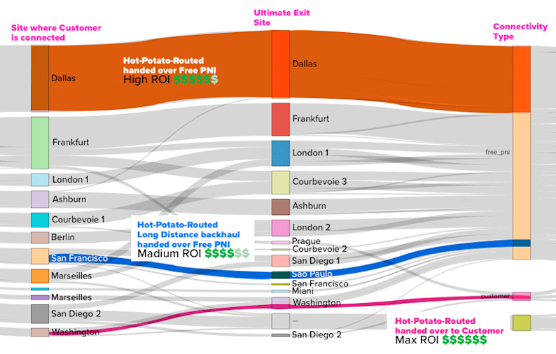
The fact that Kentik Detect enables us to see different paths like the ones that we’ve colored in the diagram above illustrates that we can use it to precisely establish the different types of traffic that can be compounded into an ROI — weighted by traffic volume —for each customer. A ballpark ROI analysis can be conducted by eyeballing a Sankey generated from the settings shown above, which can be downloaded as an image to share during a traffic engineering or sales meeting. Or the underlying data can be exported from Kentik Detect (either as CSV via the portal or as JSON via our APIs) for further analysis in a financial or BI environment.
Ready to learn more about using Interface Classification, and about Kentik in general? Schedule a demo or sign up for a free trial today.
