Summary
Kentik NMS collects valuable network data and then transforms it into usable information — information you can use to drive action.
I recently explored why Kentik built and released an all-new network monitoring system (NMS) that includes traditional and more modern telemetry collection techniques, such as APIs, OpenTelemetry, and Influx.
After that, I briefly covered the steps to install Kentik NMS and start monitoring a few devices.
What I left out and will cover in this post is what it might look like when you have everything installed and configured. Along the way, I’ll dig a little deeper into the various screens and features associated with Kentik NMS.
Is it time to migrate to a modern network monitoring system?
This raises the question, as eloquently put by The Talking Heads, “Well, how did I get here?” Meaning: Where in this post do I explain how to install NMS?
My answer, for this moment only, is, “I don’t care.” You can refer to the previous post for a walkthrough of the installation, and many “how to install Kentik NMS” knowledge articles, blog posts, music videos*, and Broadway plays are either already available or will exist by the time you finish reading this post. But for this post, I’m not going to spend a single sentence explaining how NMS is installed. My focus is entirely on the benefit and value of Kentik NMS once it’s up and running.
* There will absolutely NOT be a music video - the Kentik legal team.
** OH HELL YES, WE ABSOLUTELY WILL!! - the Kentik creative marketing group (who do the final edit of blogs before they post)
In case you’re more of a watcher than a reader, I’ve included a brief video version of this post below:
Portrait of a network outage
And to think, your day had started so well. The sun was shining, the birds were singing, the coffee was fresh and hot, and you could feel the first flutters of hope – hope that you’d be able to get some good work done today, hope that you could take a chunk out of those important tasks, or hope that you could avoid the unplanned work of system outages.
And then came the call.
“The Application” was down. Nobody could get in. Nothing was working.
Now, let’s be completely honest about this. “The Application” was not, in fact, down. The servers were responding, the application services were running, and so on. But, being equally honest, it was slow.
As we all know, “slow” is the new “broken.” Even if it wasn’t literally down, it wasn’t fully accessible and responsive, which means it was effectively down.
What differentiates today from all the dark days in the past is that today, you have Kentik NMS installed, configured, and collecting data – data that the Kentik platform transforms into usable information that you can use to drive action.
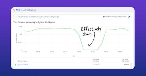
Let’s look at “The Application” – at the data flowing across the wire:
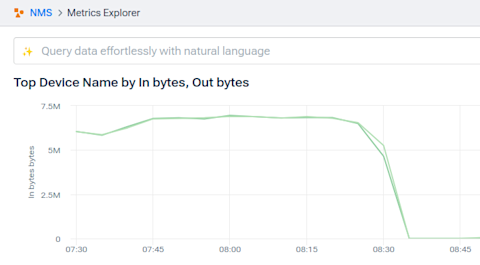
By any account, that’s pretty down-ish.
The problem is that a count of the inbound and outbound data doesn’t tell us what’s wrong; it just tells us that something is wrong.
Likewise, the information from so-called “higher level” tools – monitoring solutions that focus on traces and such – might tell us that the flow of data has slowed or even stopped, but there’s no indication why.
This is why network monitoring still matters – both to you as a monitoring practitioner, engineer, and aficionado and to teams, departments, and businesses overall.
The smoking ping
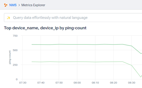
We can see, at exactly the moment, a drop in the most basic metric of all: the ICMP packets received by the devices.
Now, ICMP packets (also known as the good old “ping” are still data, but when they’re affected equally and simultaneously with application-layer traffic, there’s a good chance the problem is network-based.
What we have here
What was the problem? I’ll leave it to your experience, history, and imagination to fill in the blanks. In my example above, I changed the duplex setting on one of the ports, forcing a duplex mismatch that caused every other packet (or so) to drop. But it could have been a busy network device, a misconfigured route, or even a bad cable.
In terms of making the case for Kentik NMS, the upshot is that network errors still occur. Often. And application-centric tools are ill-equipped to identify them, let alone help you resolve them.
Move along now. Nothing to see here.
Almost as fast as it started, the problem is resolved. With the duplex mismatch reversed, pings are back up to normal:

And the application traffic is back up with it:

You pour yourself a fresh cup of coffee, listen to the birds chirping outside the window, and settle into what continues to look like a great day.
Time for a quick tour
Now that I’ve given you a reason to want to look around, I thought I’d spend some time pointing out the highlights and features of Kentik NMS so you could see the full range of what’s possible.
The main NMS screen
We’ll start at the main Kentik screen, the one you see when you log into https://portal.kentik.com. From here, click the “hamburger” menu in the upper left corner and choose “Network Monitoring System.” That will drop you into the main dashboard.

On the main screen, you’ll see:
- A geographic map showing the location of your devices
- A graph and a table showing the availability information for those devices
- An overview of the traffic (bandwidth) being passed by/through your infrastructure
- Any active alerts
- Tables with a sorted list of devices that have high bandwidth, CPU, or memory utilization
The Devices list
Returning to the hamburger menu, we’ll revisit the “Devices” list, but now that we have devices, we’ll take a closer look.

This page is exactly what it claims to be – a list of your devices. From this one screen, you have easy access to the ability to:
- Sort the list by clicking on the column headings.
- Search for specific devices using any data types shown on the screen.
- Filter the list using the categories in the left-hand column.
There are also some drop-down elements worth noting:
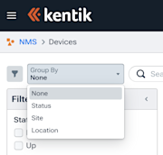
- The “Group By” drop-down adds collapsable groupings to the list of devices.
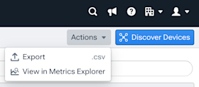
- The “Actions” drop-down will export the displayed data to CSV or push it out to Metrics Explorer for deeper analysis.
- The “Customize” option in the upper right corner lets you add or remove data columns.
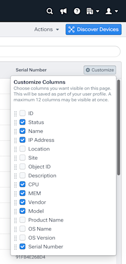
The friendly blue “Discover Devices” button allows you to add new devices to newly added or existing collector instances.
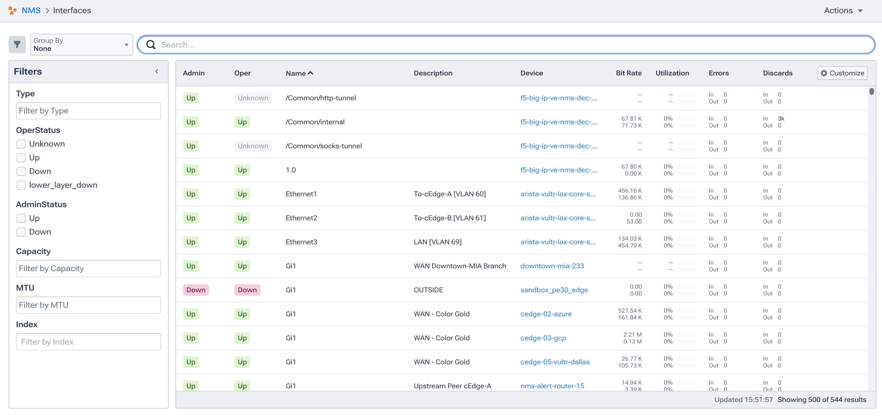
The Interfaces list
Remember all the cool stuff I just covered about devices? The following image looks similar, except it focuses on your network interfaces.
Metrics Explorer

Metrics Explorer is, in many ways, identical to Kentik’s existing Data Explorer capability. It’s also incredibly robust and nuanced, so much so that it deserves and will get its own dedicated blog post.
For now, I will give this incredibly brief overview just to keep this post moving along:
First, all the real “action” (meaning how you interact with Metrics Explorer) happens in the right-hand column.
Second, it’s important to remember that the entire point of the Metrics Explorer is to help you graphically build a query of the network observability data Kentik is collecting.
With those two points out of the way, the right-hand area has five primary areas:
- Measurement allows you to select which data elements and how they are used.
- The initial drop-down lets you select the broad category of telemetry from which your metrics will be drawn. For NMS, you will often select from either the /interfaces/ or the /device/ grouping.
- Metrics indicate the data elements that should be used for the graph.
- Group by Dimensions will create sub-groupings of that data on the graph. Absent any “group by,” you end up with a single set of data points across time. Grouping by name, location, etc, will create a more granular breakdown.
- Merge Series is a summary option that allows you to apply sum, min, max, or average functions to the data based on the groupings.
- Visualization options: This section controls how the data displays on the left.
- Chart type: Line, bar, pie, table only, etc.
- Metric: The column that is used as the scale for the Y-axis.
- Aggregation: Whether the graph should map every data point, an average, a sum, etc.
- Sample size: When aggregating, all the data from a specific time period (from 1 to 60 minutes) will be combined.
- Series count: How many items from the full data set should be displayed in the graph
- Transformation: Whether to treat the data points as they are or as counters.
- Time: The period of time from which to display data and whether to display time markings in UTC or “local” (the time of whatever computer is viewing the graph).
- Filtering: This will let you add limitations to include data that matches (or does not match) specific criteria.
- Dimension: Non-numeric columns such as location, name, vendor, or subnet.
- Metric: Numeric data.
- Table options: These set the options for the table of data that displays below the graph and lets you select how many rows and whether they’ll be aggregated by Last, Min, Max, Average, or P95 methods.
AD&D: About data and device types
After folks see how helpful Kentik can be, the next question is usually, “Will it cover my gear?” While a list of vendors isn’t the same as a comprehensive list of each make and model, this is a blog post, and nobody will take that kind of time. Meanwhile, the list below should still give you a good idea of what is available out of the box. From there, modifying existing profiles to include specific metrics or even completely new devices is relatively simple.
As of the time of this writing, Kentik NMS automatically collects data from devices made by the following vendors. For the legal-eagles in the group who are sensitive about trademarks, capitalization, and such, please note that this is a dump directly out of device-type directory:
- 3com
- a10_networks
- accedian
- adva
- alteon
- apc
- arista
- aruba
- audiocodes
- avaya
- avocent
- broadforward
- brother
- calix
- canon
- cisco
- corero
- datacom
- dell
- elemental
- exagrid
- extreme
- f5
- fortinet
- fscom
- gigamon
- hp
- huawei
- ibm
- infoblox
- juniper
- lantronix
- meraki
- mikrotik
- netapp
- nokia
- nvidia
- opengear
- palo_alto
- pf_sense
- server_iron
- servertech
- sunbird
- ubiquiti
- velocloud
- vertiv
- vyos
The mostly unnecessary summary
Of course, this is just the start of your Kentik NMS journey. There is so much more to the platform, from adding custom metrics and new devices to building comprehensive dashboards that contextualize data to creating alerts that convert monitoring information into action. I will be digging into all that and more in the coming weeks and months, even as Kentik NMS continues to grow and improve.
I hope you’ll stick with me as we learn more about this together. If you’d like to get started now, sign up for a free trial.

