Summary
Can BGP routing tables provide actionable insights for both engineering and sales? Kentik Detect correlates BGP with flow records like NetFlow to deliver advanced analytics that unlock valuable knowledge hiding in your routes. In this post, we look at our Peering Analytics feature, which lets you see whether your traffic is taking the most cost-effective and performant routes to get where it’s going, including who you should be peering with to reduce transit costs.
Kentik’s Advanced Analytics Turns Routes into Insights

When it comes to routing traffic on the global Internet, BGP is the one and only protocol. While it’s not perfect, it has withstood the test of time and is now so embedded in how the Internet works that it would be near impossible to change. That’s why network engineers have long used the BGP routing table on routers or looking glasses to get an idea of how their Internet traffic is routed. An experienced network engineer can read a BGP table like Neo reads the code in the Matrix. Kentik was founded by network engineers, and we’ve taken BGP-reading a step further by marrying the routing table on network devices with flow data (e.g. NetFlow) coming from those devices. This gives you the ability to analyze your route table in ways that were never before possible. When I was a network operator, this type of visibility would have been a game changer. What would I have done with all the time I saved? This is the premise behind the Analytics features in Kentik Detect, Peering Analytics and Route Traffic Analytics. We’ll look at Peering Analytics in this post and at Route Traffic Analytics in a future post.
Peering Analytics
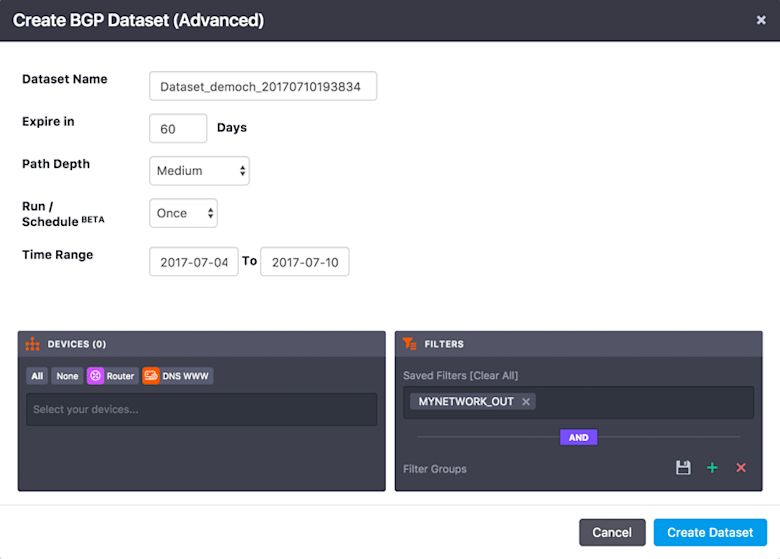
Peering Analytics allows you to visualize the traffic leaving your network by geography, site, or BGP AS path. This is extremely useful to Peering Coordinators and IP Capacity Planning teams but can also be used as a target prospect tool by Sales and Marketing teams at service providers. To use this powerful feature you must be running BGP between at least one device in your network and the Kentik Data Engine (KDE). Details on how to do that can be found in Knowledge Base topics BGP Overview and Router BGP Configuration. Once that is done, Peering Analytics can be found in the Kentik Detect portal at Analytics » Peering. You will also want to have 3-4 days worth of flow data stored in the Kentik Data Engine (KDE) for Peering Analytics to return useful information. Before jumping into peering visualizations you must first define a BGP Dataset. The BGP Dataset allows you to precisely specify the information that you want to include in your analysis. When creating a Dataset, you determine which devices you want to look at, how you want to filter the traffic (we recommend using the MYNETWORK_OUT tag described in our Knowledge Base), the time range for the data, and the depth of the path information. Since this feature uses one-hour slices of data, the minimum Time Range is two days. For more details on each option check out our KB topic Dataset Advanced Fields.

Once you click on Create Dataset you will be returned to the BGP Dataset List. Make sure that the Rows (#) field is incrementing which tells you that your Dataset is being populated with data.

Visualizing Your Routes
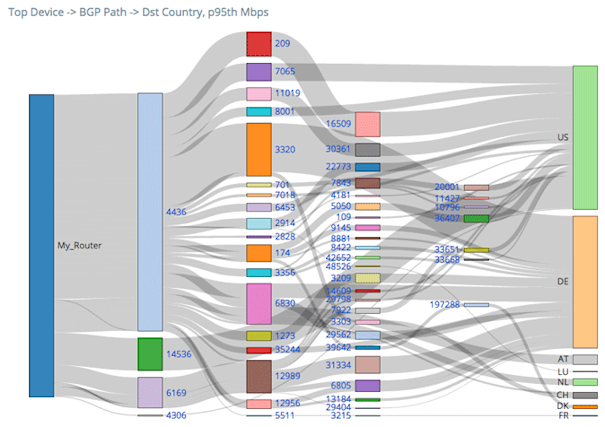
Now that we’ve built our Dataset, let’s take a look at the awesome visualizations available from this feature. To get started, click on the Peering link in the list (at the right of the row, under Actions) to bring up the Peering Analytics page. In the left pane, you have some options to narrow down what you are looking at. You can narrow to individual devices, filter on a number of dimensions, filter by Interface, and filter by ASN. In the main pane you’ll see visualizations of your BGP Path data. The first one should look something like this:

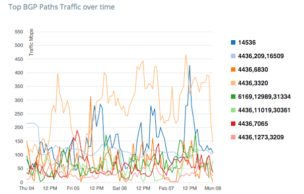
This is a Sankey diagram showing the BGP paths that your traffic is taking through the Internet to reach it’s destination. The width of each grey bar indicates the proportion of the traffic that is taking a given path. If you hover over a grey bar, it will give you more details on the source and destination of that particular path and how much traffic is following it. The next visualization we will see further down the page is a time-series line graph that looks something like this:

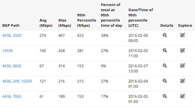
Each line on this graph represents a different BGP Path. On the Y-axis we have the Mbps that is taking that particular path. This is plotted against a timeline on the X-axis. The final visualization we have on the BGP Path tab is a table of the data from these two graphs. This one should look something like this:

Each row in the table represents a different BGP path. To get more details you can click on the magnifying glass in a given row to get a popup with additional visualizations for that specific BGP Path. Clicking on the graph icon in the Explore column will load this data into the Data Explorer where you can dive even further into the traffic details. In addition to the valuable information on this BGP Path tab there are four more tabs to explore. While all of these tabs have similar visualizations, each displays slightly different types of information:
- Transit ASNs - This shows the sum of traffic through and to each ASN (after the first hop). This allows you to see potential peers and customers that you may want to contact.
- Last-Hop ASNs - This shows the ASNs and countries to which traffic leaving your network is ultimately going, which allows you to quickly see where your traffic is being consumed. This is particularly helpful for content providers who need to be able to see who is consuming their content.
- Next Hop ASNs - This shows the traffic from your network to the ASNs with which you have a direct BGP relationship. This allows your IP Capacity Planning team to see the total traffic across the network that is being sent to each BGP neighbor.
- Countries - This shows the source and destination countries of traffic flowing through your network.
As you can see, once you start looking at your BGP tables combined with flow data you can extract a lot of useful information. As a scale-out big data SaaS, Kentik Detect is uniquely capable of providing these insights. To learn more about how Kentik Detect can unlock the knowledge hiding in your BGP routing table, request a demo or start a free trial. If you’re already a customer, consult our Knowledge Base or contact support for more detailed information on how to use Peering Analytics.
