Summary
My Kentik Portal, Kentik’s white-label network observability portal, is now available to all Kentik customers. We’ve lifted access restrictions, so you can take advantage of its features without complex activation. Plus you’ll find numerous enhancements based on interviews with existing users.

Users with a sharp eye may have noticed a new item making its way into Kentik’s navigation menu: My Kentik Portal (MKP).
Existing users may be familiar with this Kentik function, as it was previously available to a subset of customers. Now we are making My Kentik Portal available to the wider customer base for adoption.
The new features of MKP are:
- An updated My Kentik Portal experience with new v4 portal UX standards
- Access restrictions lifted to My Kentik Portal, which means:
- All users can take advantage of the features without complex activation
- Default usage limits are set higher to allow prospective users to test MKP in a meaningful way
- Numerous feature enhancements based on interviews with the existing users
The product team believes we have largely delivered on these goals, but see for yourself and let us know what you think!
My Kentik Portal in a Nutshell (if you’ve missed the previous episodes)
For those who are unfamiliar with My Kentik Portal, let’s rewind and spend a moment to explain what it is. In a nutshell, My Kentik Portal is Kentik’s white-label network observability portal.
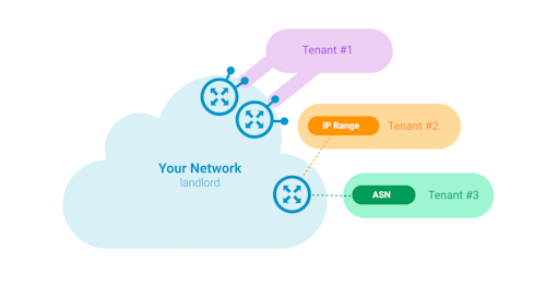
It allows Kentik customers (they’ll be referred to as “landlords”) to offer network observability and analytics to their own customers (who’ll then be referred to as “tenants”).
My Kentik Portal comes with a dual interface:
-
The landlord interface, allowing landlords to provision and configure tenants, the partitions of the infrastructure data they have access, and the visualizations and alert policies that each one of them will be offered. The landlord interface is also the place where landlords will configure general attributes of the tenant interface such as branding, or the URL at which the latter is available.
-
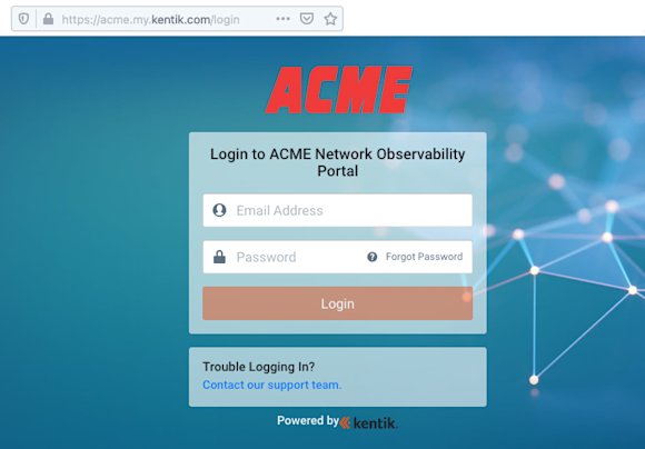
The tenant interface, is a standalone branded portal, separate from the well-known Kentik Portal that the landlords know and love. In this interface, the tenants are able to consume the analytics and alerts configured for them by landlords.
Do You Need My Kentik Portal?
If your company sells infrastructure services, chances are you will want to give My Kentik Portal a test drive. Go for it! Kick the tires and let us know what you think, we’re just getting started, and are more than happy to hear your feedback and incorporate it into future releases.
Here are some reasons to check out My Kentik Portal:
-
In a competitive market place, My Kentik Portal will allow you to add differentiated and visible value to your customers by delivering tailored analytics on top of your existing portfolio of infrastructure services.
-
As soon as you start monitoring your infrastructure with Kentik, the network data is immediately available to partition and can be offered to your customers without any additional service fee. My Kentik Portal is a great way to put your network observability data to work and monetize it.
My Kentik Portal at a Glance
If what you’ve read so far makes you curious, read on as we go through a few of the noteworthy features that come with this release.
Flexible Tenant Data Partitioning and Visualizations
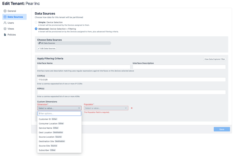
For every configured tenant, landlords can leverage a comprehensive list of filters to determine how to partition the network data for customers.
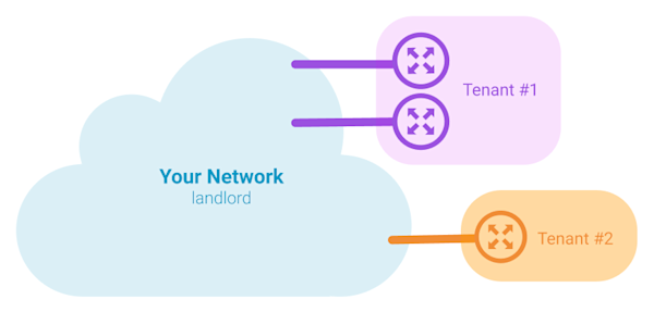
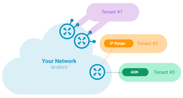
From simple cases where all the telemetry data from one or more network devices can be assigned to a tenant, to the more complex cases where tenants can only be defined by a set of interfaces, or IP blocks or ASNs assigned to them, all the way down to your own custom dimensions to help assign traffic data:
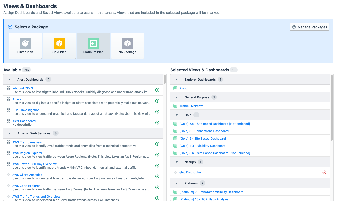
Additionally, every tenant can be assigned a different set of visualizations, dashboards and alert policies, to best fit their precise analytics requirements:
Tenant Packages
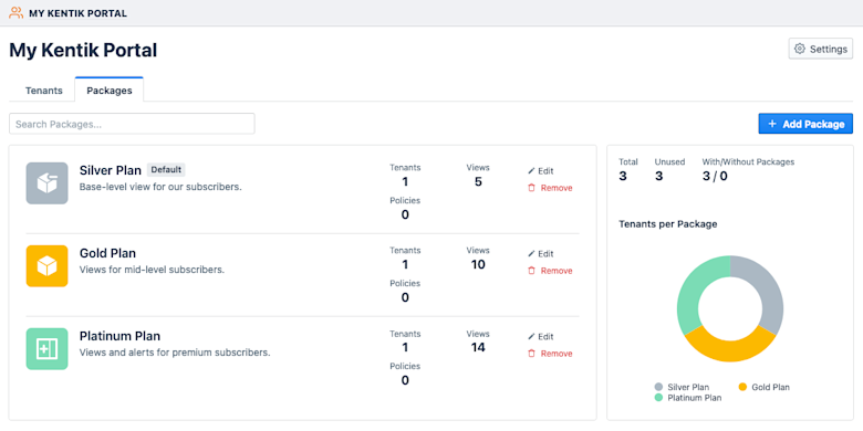
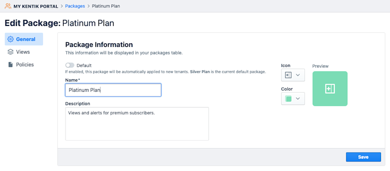
To simplify the provisioning of tenants, landlords can build “packages.” Packages are the literal SKUs for their network analytics offer, allowing them to bundle multiple dashboards, network visualizations and alert policies into groupings of content that they can directly assign to tenants. The Packages UI also allows you to keep an eye on the metrics behind each package, and package usage across tenants.
Helpers to Build Tenant Content
While moving My Kentik Portal over to the new v4 experience and interviewing existing users, we realized that we needed to help landlords more efficiently produce visualizations and dashboards for their tenants. In the previous iteration, landlords had to juggle between Data Explorer or dashboard editing and the tenant UX to visualize the content they were creating through the eyes of their tenants.
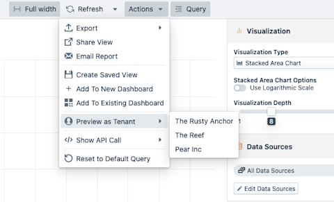
In v4, landlords now have access to the “Preview as Tenant” top item within Data Explorer and Dashboard Editor Actions menu, as displayed below. This menu will get populated as soon as the first tenant is provisioned.
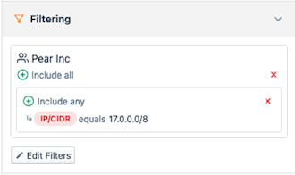
Upon selecting a tenant to display the current dashboard or view, a named filter will be appended to the associated query controlled, containing the name of the selected tenant, as depicted below — this additional filter will correspond to the specifics of the data partition configured for this tenant, no matter how complex it is.
A Redesigned Tenant UX
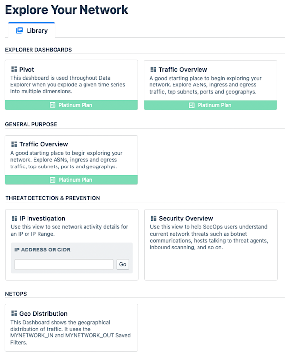
Last but not least, the overall tenant experience has been overhauled, as you can see from the screenshot below:
I’d like to name a few other improvements to the new v4 tenant experience:
- Available visualizations now take the full screen and look more inviting
- The description coming with the dashboard or visualization is now displayed within the tenant UX homepage.
Tip: Make sure your tenant content has appealing and explanatory descriptions! - Guided Mode dashboards now have a direct prompt in the homescreen
- Views contained in a tenant package now have a bottom label identifying at which package you are looking
Wrapping up
While already a substantial update, this initial v4 release of My Kentik Portal marks just the beginning of the envisioned product roadmap.
Now that we’ve released it, and made it available to everyone without restrictions, our job is done and yours starts. Please help us make My Kentik Portal better by providing your feedback as we plan for future iterations!


